

R E D E S I G NOverview
Client: Clear-Com ↗️
Innovates technologies that connect teams through wired and wireless systems.

Objectives:
The primary objective of this UX project is to re-platform the existing digital product to create a more user-friendly interface, optimize performance, and align with WCAG's AA standards for accessibility.
Tools used:
Sketch, Figma & Zeplin
My Role:
UI/UX Designer
Deliverables:
Developing a design systems guide and redesigning functional pages.
Establishing consistency, optimizing user flow, and reducing friction points.
Design Process

User Assumptions
Efficient and knowledgeable tech industry professional familiar with Clear-Com products. Seeks quick and straightforward website experience. Focus on robust search, clear navigation, concise product details, and easy support access for seamless user experience.
Technology constraints:
- Desktop and smartphone availability
- Has Internet to operate the website, but for some edge cases don’t have internet due to isolated location or sea voyage.
Rethinking Brand Color & Typography
Improved color palette
AA level (which is our baseline target) needs the contrast to meet 4.5:1 for normal text (smaller body text, ie. under 18px) and 3:1 for large text (headlines and text over 18px)
Pairing
To achieve correct contrast ratios light colors (or white) need to be paired with dark colors.
Aesthetically colors should also be kept in the same family or the reverse.
Typography
To establish a clear visual hierarchy, type weights were strategically utilized.
For smaller-sized text, the Inter typeface was recommended due to its optimal readability and legibility.
Inter, with its broader and taller design, enhances the overall reading experience.


Designing — Resource Filtering Page
This page is a comprehensive hub offering diverse resources for products. Users can access instructional documents, video tutorials, and more.
Problems:
#1
The page had a dual filtering system with top icons and right-side tags that dynamically altered the displayed content, but unfortunately, users were unable to utilize it.
Solution:
Revamped the filtering system for improved user utilization. Implemented a simplified design with a single tag selection group.
Collaborated with the content team for effective tag categorization through card sorting.
#2
Users struggled to identify the page location and found excessive and confusing tags.
Enhanced usability, empowering users to dynamically alter displayed content and find information efficiently.

Designing — Download Center Page
Here you can access and download product documents, brochures, technical resources, and stencils for different versions. Simplify your search for materials in one convenient location.
Problems:
#1
The absence of a filtering procedure made it challenging for users to streamline search results based on content type, leading to a less efficient and time-consuming browsing experience.
#3
Users traveling to areas without online connectivity faced difficulty in quickly accessing and downloading all files related to a product.
Solution:
Filtering System:
Added a system to streamline search results by content type, enabling users to quickly access specific content.
Enhanced Search Bar:
Modified the search bar to include a content type filter, allowing users to select their desired content type and obtain more relevant search results.
#2
Users had to manually scroll through multiple pages to find results specific to a particular product version, despite the presence of a search bar intended for this purpose, resulting in user frustration.
Version Menu & Download Button
Introduced a product version dropdown menu for a swift selection of desired versions, as well as a "Download All" button to quickly download all files related to a product, improving efficiency and user convenience.

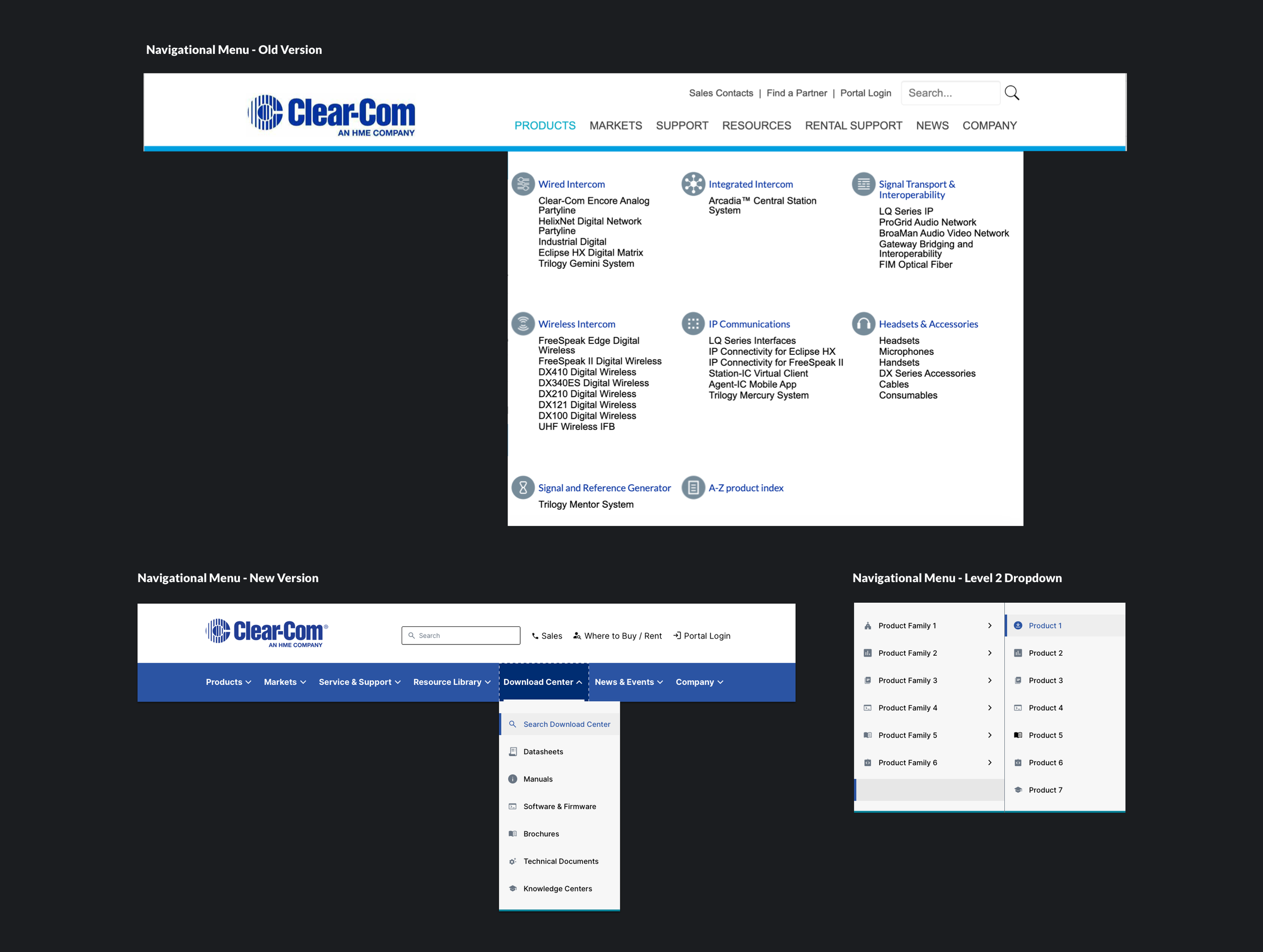
Information Architecture (Menu)
Problems:
#1
Users couldn't find the download center link in the menu, leading to frustration. To fix it, they created multiple links to multiple locations to improve discoverability.
Solution:
Elevating the link
The download center link was prominently placed in the primary menu, ensuring easy access and visibility for users. By bringing it to the forefront, users can quickly locate and navigate to the download center without any confusion.
Cascading System
A cascading system was introduced to assist users in understanding the hierarchical structure of the menu.
#2
The tight typographic layout made it hard for users to navigate pages and groups. This hindered efficient information retrieval.
Enhancing Perceivability
To improve the visibility and understanding that the menu contains additional links, a dropdown icon was added next to each menu item.
Accessible Carousel
Carousels were used on the home page to showcase new products and feature multiple pieces of content within a limited space.
Problems:
Carousels often suffer from banner blindness, as users quickly scroll past them, potentially missing important information. Additionally, users may struggle to control the carousel or anticipate the next image, leading to frustration and reduced engagement.
Solution:
Accordion
we implemented an accordion-like carousel that enhances control and mitigates banner blindness. It allows users to expand or collapse panels, providing a more intuitive and engaging experience.

Design Systems
Grids
Grids are essential tools in design. They consist of columns and gutters that help us arrange text, images, and components consistently for a polished and cohesive look.

Buttons and Links
Buttons are interactive elements that prompt actions. They provide a clear and clickable interface for users to engage with a website or application.
