Unleash Your National
Spirit, Virtually!
PROBLEM
The COVID-19 lockdown has left fans unable to support their national team at the Winter Olympics stadium. Fans were looking for ways to engage and show their national pride, even from home.
Solution
An immersive application that allows users to virtually experience the atmosphere of a stadium engagement. Fans will have the opportunity to cheer, support, and engage with their national team.

Key Features
An Adaptive UI based
on the nation you support.
Discover the magic of the interface, featuring dynamic layouts crafted with three surfaces. Experience a personalized journey that adapts to your nationality, celebrating your unique identity.
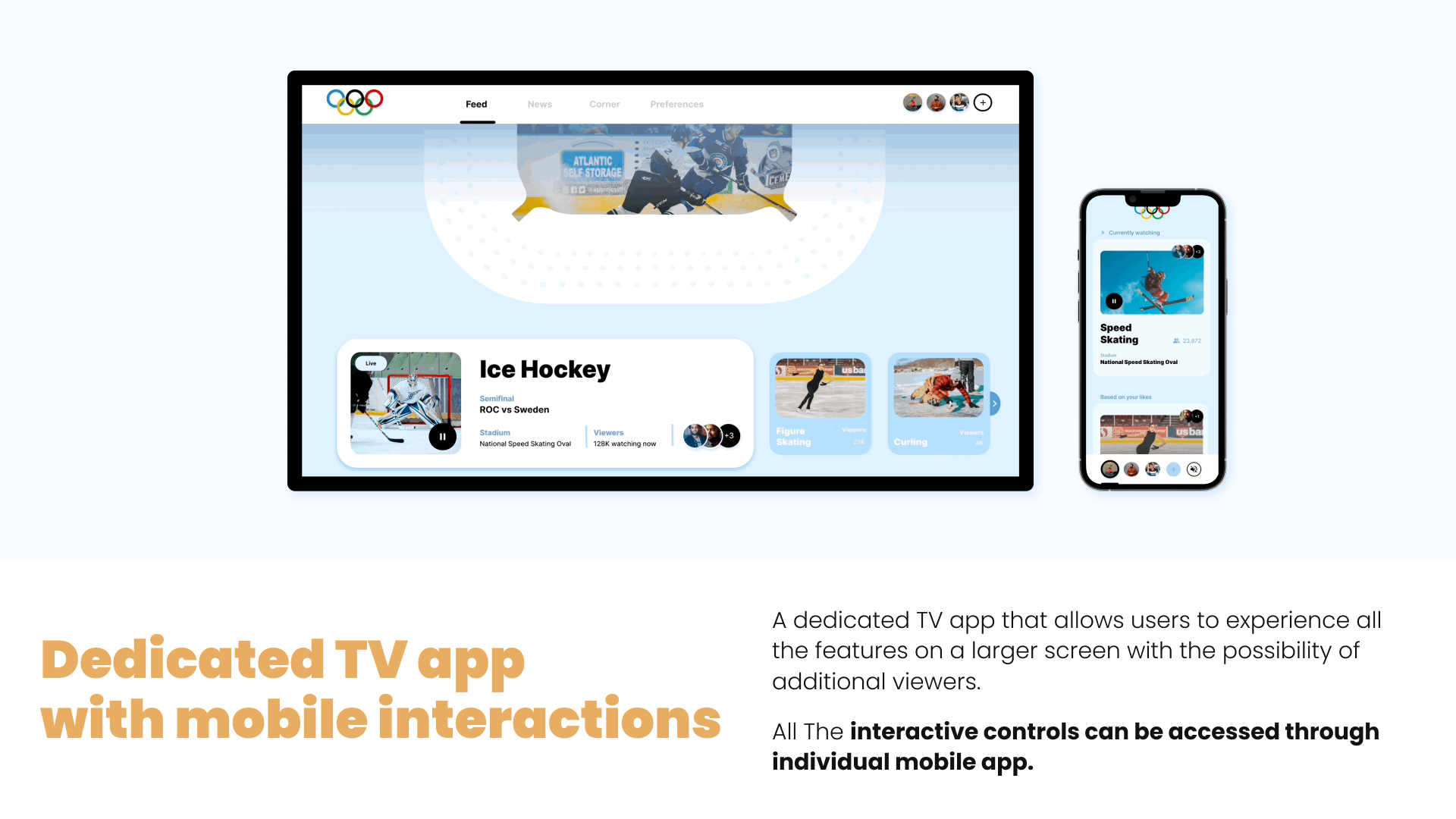
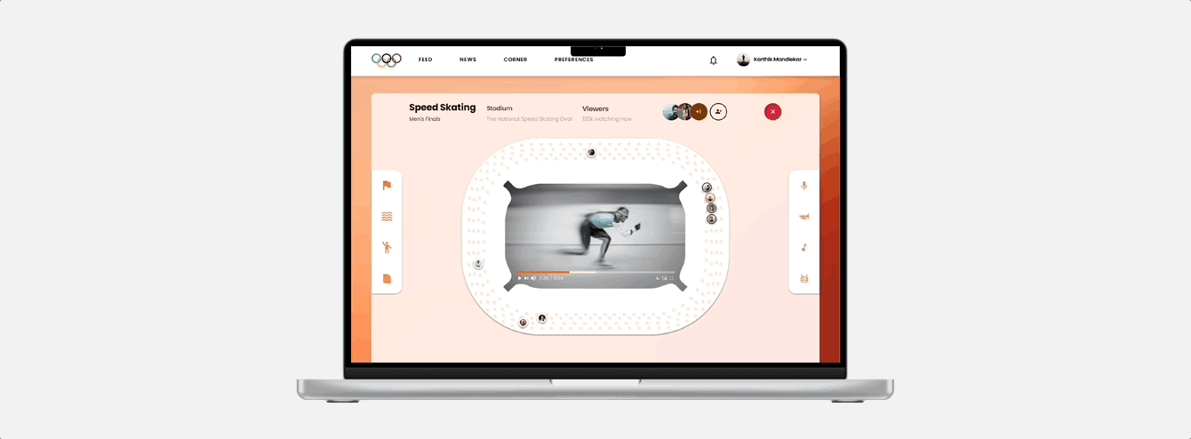
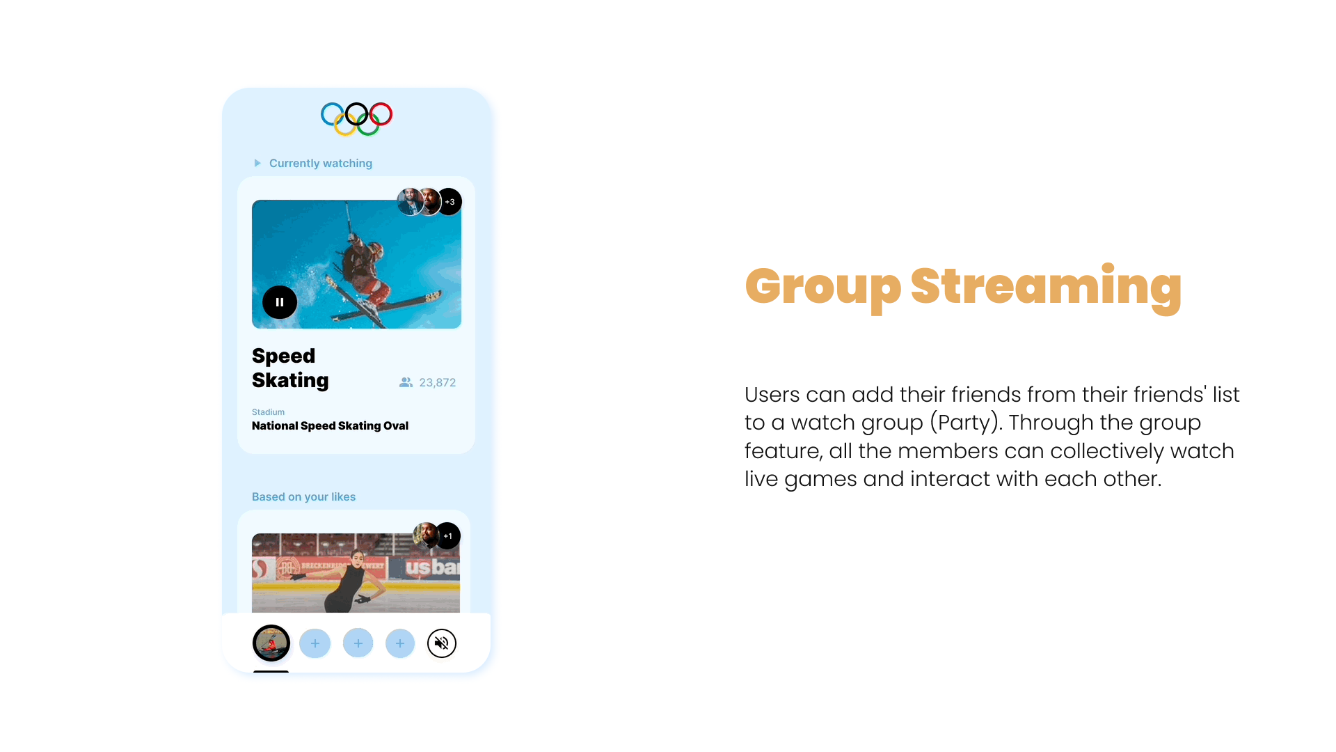
Express & Engage with
Other Fans
The interface puts you in command with interactive controls on both sides. Connect with fellow fans, share your excitement, discuss key moments, and cheer together for your national team during the Winter Olympics
Expandable Screen for a better viewing experience
Experience sports like never before with our expandable screen feature. Using your watch device you can still engage with other fans.


UX Research
Interview Insights
The interviews I conducted aimed to understand users' motivations, goals, and preferences when watching sports games from home compared to their experiences in a stadium. Interviewed three students from different nationalities.
“I enjoy watching interesting games, especially during the Winter Olympics. Having a digital platform that brings the stadium ambiance to my screen would be fantastic”
Survey Insights
Quantitative data to validate satisfaction and preferences of SIX people who participated in the survey
66% of them
Expressed a desire to engage with their favorite teams
Cognitive
Walkthrough
To find user flow and synthesize their
pain points.
Task #1 for the user: Stream a match from the Olympics website
Pain points:
Navigating to watch a sport is not intuitive.
The website normalizes the viewing experience even though there are multiple stadiums.
To stream the games you need to go to a different website.
Task #2 for the user:
Play fantasy games from the Olympics website
Pain points:
Can’t interact with other fans.
Visual identity is not consistent
Secondary Research
I conducted an extensive exploration of existing reports and articles.
This complemented the primary research, providing valuable insights and enhancing the overall depth and rigor of the study.
Social media trends:
#1
Fans are excited about the Winter Olympics, but they are disappointed that they can't attend in person. Many fans are looking for ways to still feel connected to the Games and support their national team.
Archetypes
These are a representation
of the audience that characterizes the user’s behavior & Goals

FREAK
Behavior:
Demonstrates unwavering support for the team by proudly donning their jersey while attending matches at the stadium
Goal:
Aiming to showcase dedication and pride toward a team
How might we Statements
I focused on specific challenges or opportunities, then explored diverse possibilities and generated impactful ideas.
Example #1:
How might we,
make fans feel like they are in the stadium
Example #2:
How might we,
create stadium-like audio in a website
Example #3:
How might we,
help fans make waves
or stomp
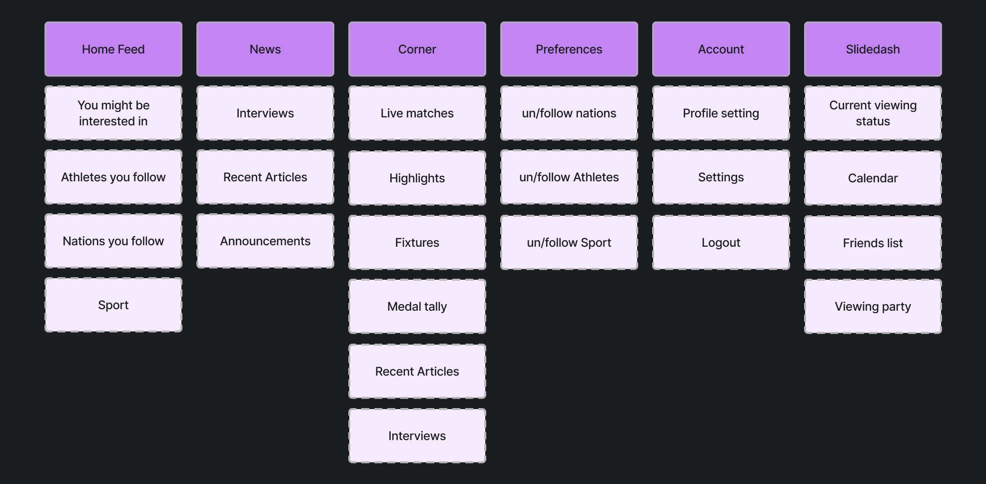
Task Flow
The diagram outlines the user's journey on the site, focusing on collecting their preferences to personalize their experience.
Information
Architecture
Designed intuitive information architecture for seamless user experience.
Enables easy navigation from data collection to personalization.
Goals:
Users want to express national pride, engage with teams, and experience the stadiums
Motivations:
A desire to cheer for teams, a sense of belonging, an opportunity to showcase their love for the game.
66% of them
wanted to engage with other viewers


Task #2’s user flow map
Website Traffic:
In 2022, the official website of the Winter Olympics received over 100 million visitors
#2
Fans are unsure about the future of the Winter Olympics. Some fans think that the Games should be canceled or postponed, while others think that they should be held virtually.
Casual Stroller
Behavior:
Keeps an eye on highly anticipated matches featuring closely contested battles between teams.
Goal:
Intents to indulge in thrilling and experience the excitement of close games
Preference:
Gets excited because of the stadium’s ambiance, a visual way to show their following, and wants to engage with other viewers.
Patterns:
Users who visit the official website are most likely to spend time on the following pages:
schedule
results
medals
athlete
#3
Many fans feel like they are missing out on a once-in-a-lifetime experience.

FREAK
Behavior:
Engages with fellow spectators in the stadium, sharing insightful commentary and punditry about the match.
Goal:
Enriching the collective understanding and enjoyment of the game.


83% of them
showed a preference that ambiance is the reason they go to the stadium
Task #1’s user flow map
Preferences:
A study by Nielsen found that 72% of sports fans would be more likely to engage with a brand if it offered them a way to virtually experience It.

Design Systems
Approach

Atoms
Elements that ensure consistency and style for a seamless user experience.
Atoms
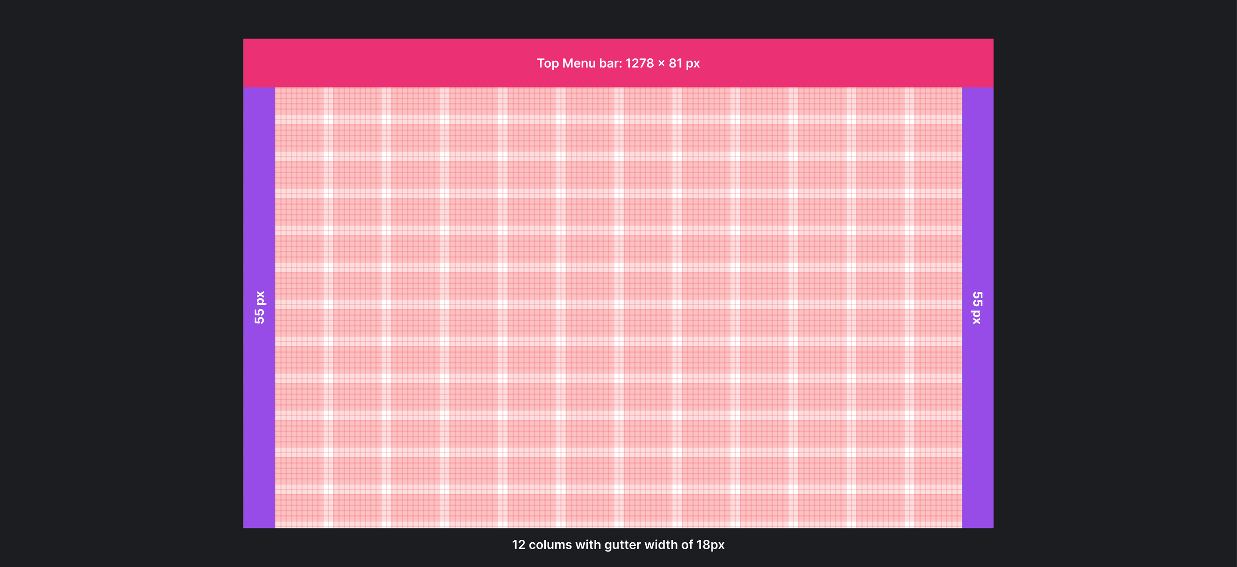
Grid
Layout system that organizes content into columns and rows, enabling flexible and visually appealing designs that adapt to different screen sizes.
Grid implemented
in the design:

Color Tokens
Centralized color management for consistent and easily maintainable color schemes
on the website.
Primary Colors
The application's focus leans toward having fun and having a passionate experience. Purple and pink make up the dominant color scheme, which also heavily relies on neutrals to achieve balance.
Secondary Colors
In order to represent all country flags, these colors are expected to be used. These colors are typically used over
a neutral hue to balance their dominating tendency. Decisions about the layout won't be made based on these colors.
Typography
Poppins typeface was chosen for its clean and modern design, enhancing readability and providing a visually appealing user experience on the website.
Type System
These are the text styles that I’ve used in the project.
Shadows
This helps how shadows help differentiate interface levels, adding depth and clarity to enhance the user’s perception of their importance.
The graph illustrates the shadow elevation levels associated with each component in the interface, indicating their relative importance.
Molecules
Buttons
Types and Sizes
These buttons with versatile leading and trailing icons can accommodate various devices and components.
States
To improve usability I’ve incorporated hover, active, and disabled states into the button system.
Menu Tabs
The tabs help users to navigate through multiple pages without reloading a new page.
Content Cards
There present information in a visually appealing manner.

Molecules
These UI components systematically combine atoms, creating cohesive and functional structures.

Organisms
Pre-built interface blocks composed of molecules, provide ready-to-use components for a consistent design.


Organisms
Desktop Navigation
This header is used across the whole application.
Mobile Navigation
These variations of the top and bottom menus are used across the whole application.

Previous Iterations

Drawer Tabs
Drawer tabs for efficient navigation, organizing content, and functionality.


Carousel
Showcases information in a dynamic and interactive manner.