

IntroductionA full UX overhaul to streamline workflows and boost engagement across web and mobile.
MY ROLEI led this major redesign at ITX as the sole designer, setting the design direction, building a unified design system, and keeping accessibility at the core throughout.
TEAMUX Designer, Content Writer, Client Stakeholders, Product Manager, Developer
DURATION3 Months (Shipped)
What does
Clear-Com do?
They power communication in high-pressure environments, like live broadcasts, concerts, and major events. Their systems keep teams connected instantly, behind the scenes. While their technology ran smoothly, the digital experience hadn’t kept up.


What drove the redesign?
The website was outdated and hard to use. Users in live events and broadcasting often came for manuals or software updates, but the site made that frustrating. We began by interviewing stakeholders to uncover user needs and business goals, and quickly aligned on the value of UX.

Validating user pain with data
The numbers confirmed it: bounce rates topped 60%, PageSpeed scored only 48, and users spent less than four minutes on the site. The experience wasn’t just frustrating; it was driving people away.
Why is finding information harder than it should be?
Through a heuristic review of the core pages, we uncovered issues with clarity and consistency that made information harder to find than expected.
/exampleThe main navigation had minimal visual feedback and a slight background change on hover, with no underline or clear indicator. Making it fall short of WCAG accessibility guidelines.

We identified additional challenges in the structure and presentation of the information. Product pages were packed with dense technical language that could overwhelm non-technical users.

On the homepage, there were no clear headings or contextual cues. Making it hard for users to understand what each section was meant
to do.

SOLUTIONDesign overhaul to make workflows more usable, content easier to find, and the site more engaging overall.
1 / 3
The Navigation Challenge: Making it easy to find what matters
Navigation was one of Clear-Com’s biggest pain points. Even simple tasks like finding the Download Center were buried under vague labels and duplicated across menus, adding clutter. Product dropdowns made things worse, overwhelming users with long lists and no clear hierarchy or cues.
To solve this, we moved the Download Center into the main navigation for better visibility.
Also, browsing was confusing because product categories weren’t organized. Cascading menus now logically group products, helping users find what they need quickly.
2 / 3
The Download Center: Hidden hurdles
Finding software, manuals, or brochures was more difficult than it should have been. The search bar was inconsistent, filtering was unreliable, and grouped collections only offered partial fixes.
On the results page, filters looked like separate sections, and the version field assumed users knew exact product details without offering guidance.
To solve this, we re-designed the search experience
We introduced a scoped search similar to Amazon. Users can select a document type, such as software, manuals, or brochures, from a dropdown in the search bar before typing.
We added a version lookup guide, replaced the open text field with a dropdown, and introduced a clean filter panel. Making it easier to find the right document.
3 / 3
Resource Library
The page was built on legacy UI patterns; cluttered with decorative, non-functional icons and an overwhelming collection of random tags generated from individual posts. This not only made filters hard to use but also created friction for users trying to browse content.
I led an affinity mapping workshop with the team to group hundreds of scattered tags into meaningful categories. Although restructuring metadata wasn’t in our initial scope, we demonstrated the user benefits and convinced stakeholders to invest in the change.
Usability solutions across pages


The redesign didn’t just look better: it performed better
Low-Fidelity Prototypes
To explore different layout options and validate user flows early in the process, I created low-fidelity wireframes. These prototypes facilitated quick iterations and helped align the team and stakeholders on the design direction before moving into higher-fidelity development.

Component Library
I built a flexible component library to ensure consistency across pages and speed up future iterations.
Buttons & Links
Filtering Component With Interactive States
Reusable Elements
Modules
Things I learned along the way
①
I learned that speaking the user’s language matters — even when the user is a stakeholder. Design terms like “IA” or “affordances” don’t always land, but showing how users get stuck usually does.
②
Visually, there wasn’t much scope to explore new UI directions — but in hindsight, small shifts like clearer containers, stronger shadows, or bolder colors might’ve brought more character and polish to the experience.
CHECK MY OTHER PROJECTS ↓
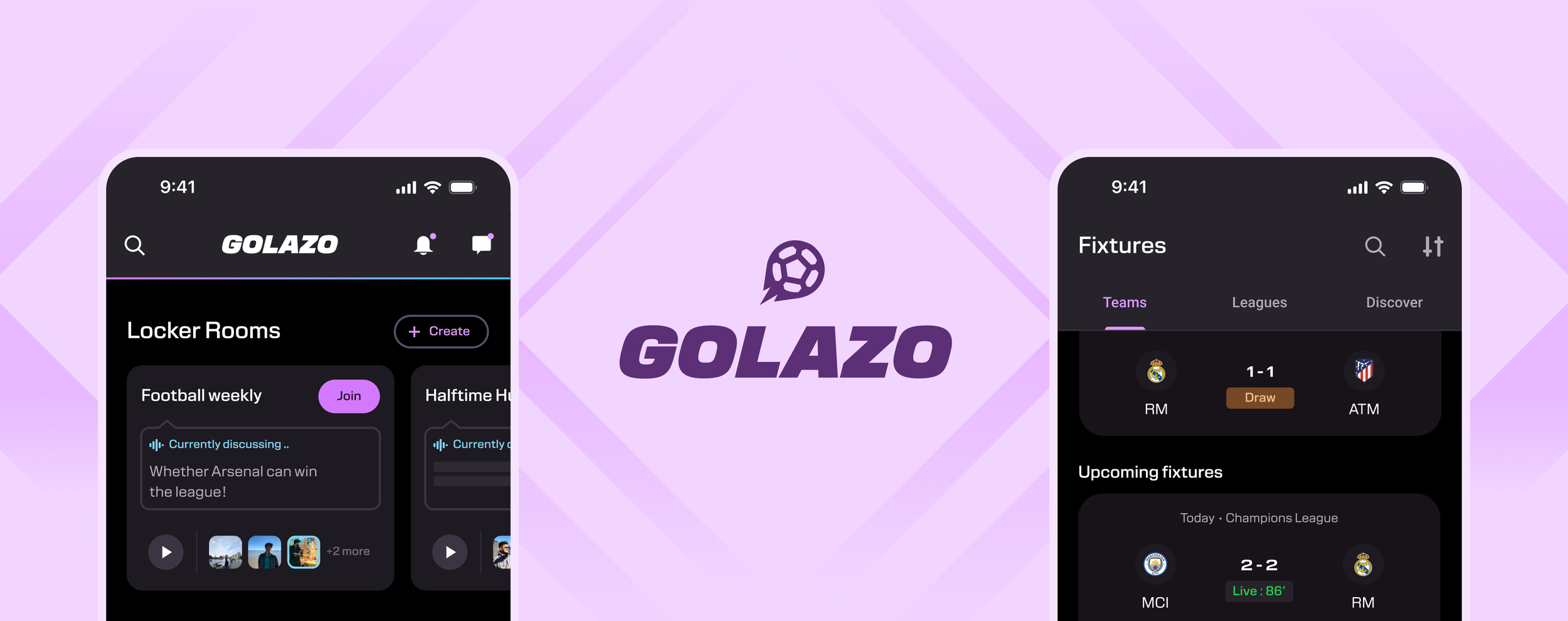
Golazo – Mobile App
Helping fans stay updated, engage in meaningful football conversations, and strengthen connections.

Cosmos Club Redesign
Redesigned and modernized the club’s digital presence, improving usability and accessibility for its members.