
CLEAR-COM
A UX overhaul that improved website usability by 30%
ABOUT COMPANY
Clearcom empowers customers through market-proven communication technology, providing broadcast solutions globally.
TYPE
Collaborative project

Company’s Logotype
Problem
The website hosts technical information about their products and also provides downloadable manuals, datasheets, and software updates, but the experience of accessing the data did not meet user expectations.
Typography System
Lato Typeface
Inter Typeface
Typography
The website had a lot of product specifications, so we chose Inter and Lato for their tall x-heights,
which improves readability at smaller sizes. We used different type weights to create a clear visual hierarchy, emphasizing important elements effectively.


Desktop Website

Mobile Website

Information Architecture
Previously, certain links were strategically placed under multiple menu items to address users' difficulty in locating them. The inadequate menu structure made it challenging for users to recall and find menu options.
To improve navigation, we implemented cascading menus, making it easier for users to browse the product catalog.
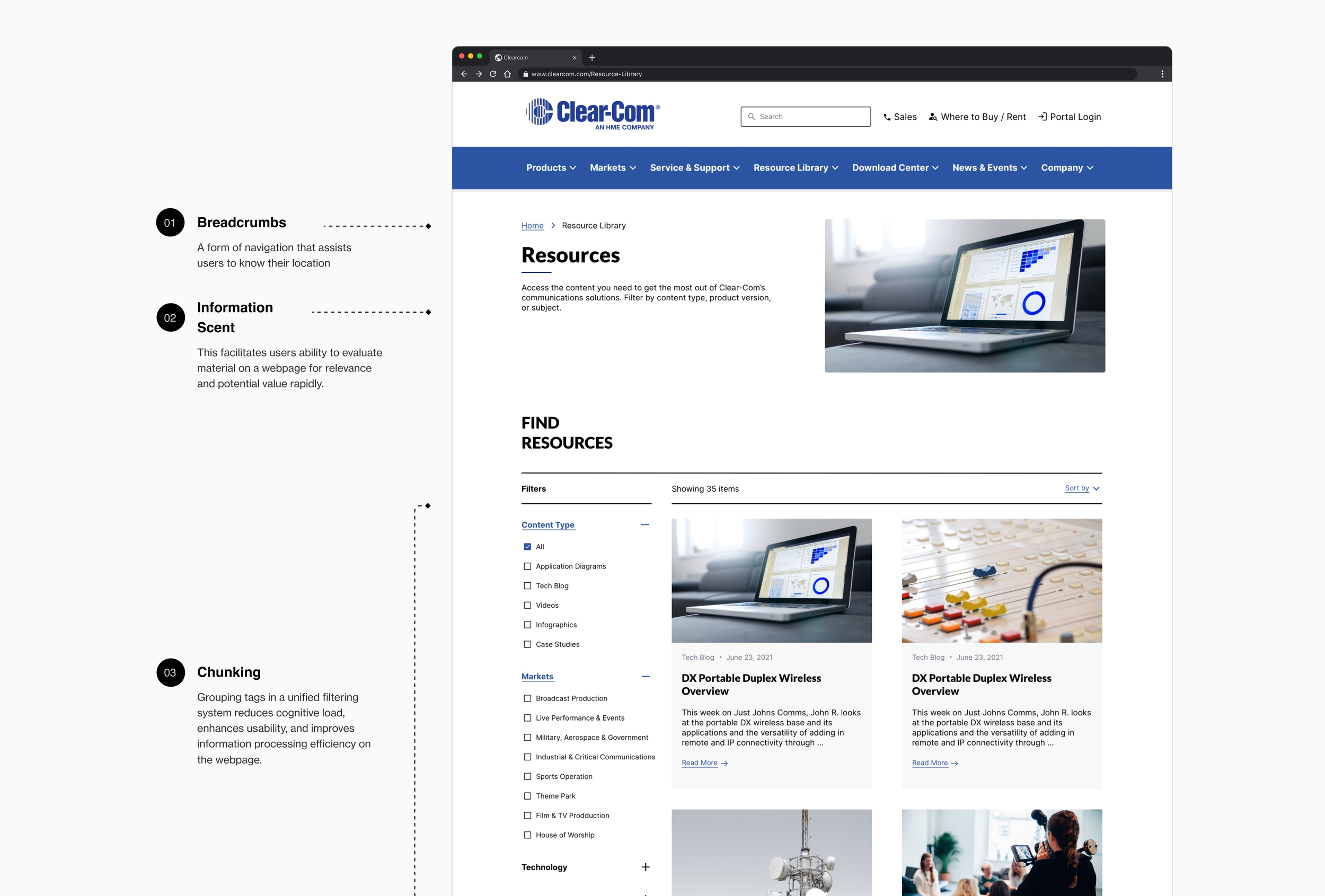
Resource Filtering Page
Previously, the page had a dual filtering system that users struggled to utilize. They had difficulty identifying the page location and found the tags excessive and confusing.
To address this, we used affinity mapping with stakeholders to strategically group content for better overall utilization.

Download Center
Users struggled to filter search results by content type, resulting in a time-consuming browsing experience
Despite having a search bar, users had to manually scroll through multiple pages to find specific product versions, causing frustration
Users encountered difficulties accessing and downloading product-related files when offline or in areas with limited internet connectivity
Buttons & Links
Filtering Component With Interactive States
Component Library
Reusable Elements
Modules
Check my other projects as well! 🔭
COSMOS CLUB ↗
Improving usability & accessibility for a prestigious social club

KOIN–ONBOARDING ↗
Designing a low-friction sign-up experience for digital-first banking

LATICRETE ↗
Testing & refining a new website design to engage younger audience before launch
