

IntroductionDesigning a low-friction sign-up experience for digital-first banking
WHAT I DIDUser Interviews, Usability Testing, Branding, Design Systems
DURATION2 Weeks
Brand + Logo
The Koin name combines "joining" and "coins" to embody the app's mission - empowering users to seamlessly transact and connect with friends worldwide.
The flowing, curved logo symbolizes two users high-fiving, reflecting Koin's reliable, empowering, and community-focused values.

Image 1: Logo in a grid

Image 3: Symbol
Image 2: Logotype
Screen feature/ Country selection
Design systems documentation
Target Users
Koin empowers young, globally mobile millennials to manage finances and stay connected, no matter where life takes them.
The inclusive, community-driven platform promotes transparent conversations around personal money matters. Seamlessly send funds, pay bills, and access financial services - all while your data securely co-exists to simplify verification.

Survey to inform design
I conducted an anonymous survey with seven participants to gather insights on their attitudes towards social banking and expectations for the onboarding process.


Usability Testing
To better understand the onboarding experience for mobile banking apps, I conducted usability testing with five participants.


Strategic Task Flow Diagram
Research Analysis
①
App’s Feature Awareness
Over half of the users (57.1%) were unclear about social banking because they didn’t understand it. During testing, only 20% of participants read the app’s explanation, showing a gap in effective communication.
②
Making Debit Card Details Optional
While most users were comfortable sharing debit card (71.4%) and bank details (57%), only 40% entered their debit card information during onboarding, indicating an opportunity to enhance user flexibility and reduce friction.
③
Importance of Biometric Authentication
All users preferred biometric sign-up options and successfully added Face ID or fingerprint authentication. However, one user’s failure to receive a verification email highlighted the critical role of biometric options in ensuring a smooth sign-up experience.
Welcome and Introduction:
Sign up, log in options
Mobile Authentication:
Adding your phone number
Account Creation:
Email, Password, and Kointag
Optional Tasks:
Completing Onboarding
Design System Documentation
CHECK MY OTHER PROJECTS ↓
Clear-Com’s Digital Experience
Led a full UX overhaul to streamline workflows and boost engagement across web and mobile.
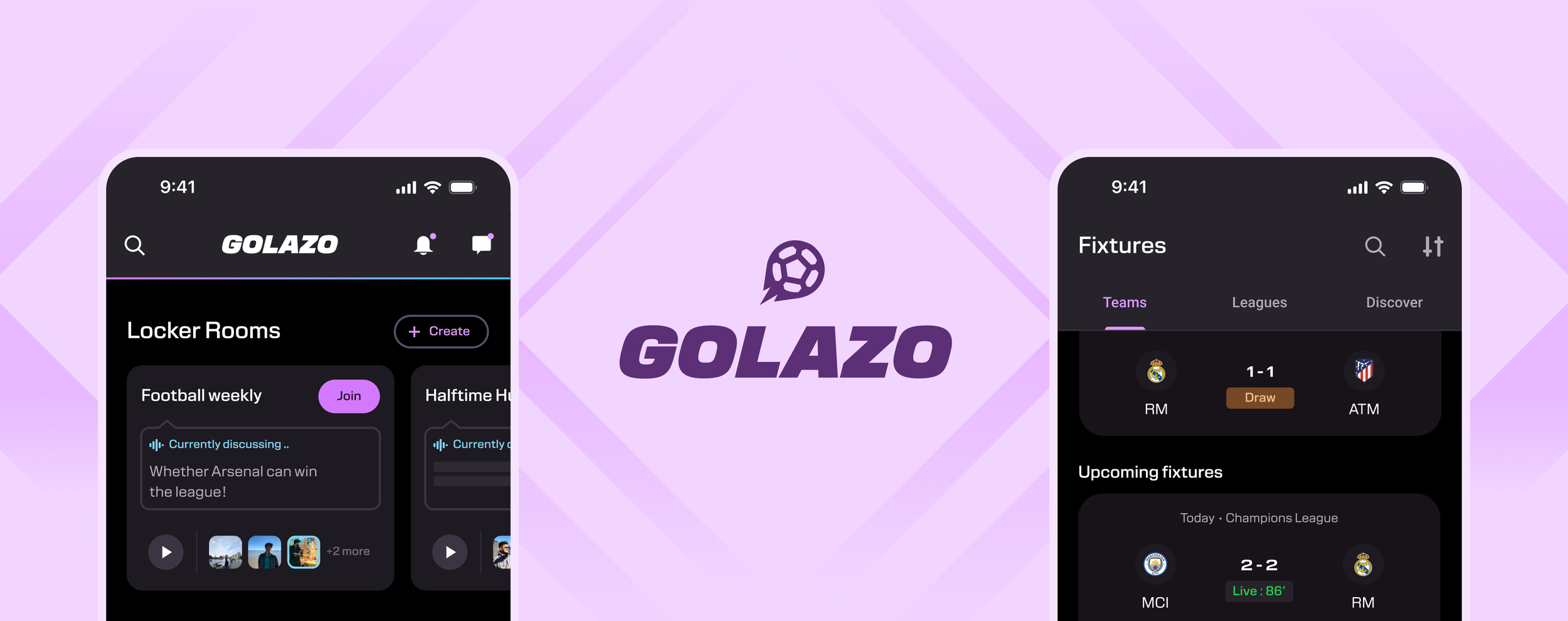
Golazo – Mobile App
Helping fans stay updated, engage in meaningful football conversations, and strengthen connections.